Why layout is so important
Layout of controls is critical to an applications usability. Arranging controls based on fixed pixel coordinates may work for an limited enviroment, but as soon as you want to use it on different screen resolutions or with different font sizes it will fail. WPF provides a rich set built-in layout panels that help you to avoid the common pitfalls.
These are the five most popular layout panels of WPF:
Best Practices
- Avoid fixed positions - use the
Alignmentproperties in combination withMarginto position elements in a panel - Avoid fixed sizes - set the
WidthandHeightof elements toAutowhenever possible. - Don't abuse the canvas panel to layout elements. Use it only for vector graphics.
- Use a StackPanel to layout buttons of a dialog
- Use a GridPanel to layout a static data entry form. Create a Auto sized column for the labels and a Star sized column for the TextBoxes.
- Use an ItemControl with a grid panel in a DataTemplate to layout dynamic key value lists. Use the SharedSize feature to synchronize the label widths.
Vertical and Horizontal Alignment
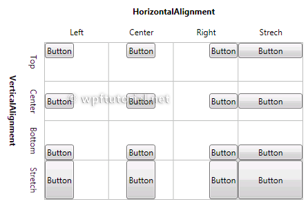
Use theVerticalAlignment and HorizontalAlignmant
properties to dock the controls to one or multiple sides of the panel.
The following illustrations show how the sizing behaves with the
different combinations.
Margin and Padding
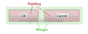
TheMargin and Padding properties can be used to reserve some space around of within the control.- The
Marginis the extra space around the control. - The
Paddingis extra space inside the control. - The
Paddingof an outer control is theMarginof an inner control.

Height and Width
Alltough its not a recommended way, all controls provide aHeight and Width property to give an element a fixed size. A better way is to use the MinHeight, MaxHeight, MinWidth and MaxWidth properties to define a acceptable range.If you set the width or height to
Auto the control sizes itself to the size of the content.Overflow Handling
Clipping
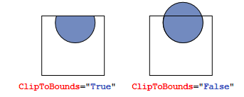
Layout panels typically clip those parts of child elements that overlap the border of the panel. This behavior can be controlled by setting theClipToBounds property to true or false.
Scrolling
When the content is too big to fit the available size, you can wrap it into aScrollViewer. The ScrollViewer uses two scroll bars to choose the visible area. The visibility of the scrollbars can be controlled by the vertical and horizontal
ScrollbarVisibility properties.<ScrollViewer> <StackPanel> <Button Content="First Item" /> <Button Content="Second Item" /> <Button Content="Third Item" /> </StackPanel> </ScrollViewer>


No comments:
Post a Comment