Introduction

The grid is a layout panel that arranges its child controls in a tabular structure of rows and columns. Its functionality is similar to the HTML table but more flexible. A cell can contain multiple controls, they can span over multiple cells and even overlap themselves.
The resize behaviour of the controls is defined by the
HorizontalAlignment and VerticalAlignment properties who define the anchors. The distance between the anchor and the grid line is specified by the margin of the controlDefine Rows and Columns
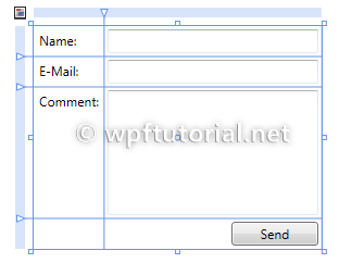
The grid has one row and column by default. To create additional rows and columns, you have to addRowDefinition items to the RowDefinitions collection and ColumnDefinition items to the ColumnDefinitions collection. The following example shows a grid with three rows and two columns.The size can be specified as an absolute amount of logical units, as a percentage value or automatically.
| Fixed | Fixed size of logical units (1/96 inch) |
| Auto | Takes as much space as needed by the contained control |
| Star (*) | Takes as much space as available (after filling all auto and fixed sized columns), proportionally divided over all star-sized columns. So 3*/5* means the same as 30*/50*. Remember that star-sizing does not work if the grid size is calculated based on its content. |
<Grid>
    <Grid.RowDefinitions>
        <RowDefinition Height="Auto" />
        <RowDefinition Height="Auto" />
        <RowDefinition Height="*" />
        <RowDefinition Height="28" />
    </Grid.RowDefinitions>
    <Grid.ColumnDefinitions>
        <ColumnDefinition Width="Auto" />
        <ColumnDefinition Width="200" />
    </Grid.ColumnDefinitions>
</Grid>
How to add controls to the grid
To add controls to the grid layout panel just put the declaration between the opening and closing tags of theGrid. Keep in mind that the row- and columndefinitions must precced any definition of child controls.The grid layout panel provides the two attached properties
Grid.Column and Grid.Row to define the location of the control.<Grid> <Grid.RowDefinitions> <RowDefinition Height="Auto" /> <RowDefinition Height="Auto" /> <RowDefinition Height="*" /> <RowDefinition Height="28" /> </Grid.RowDefinitions> <Grid.ColumnDefinitions> <ColumnDefinition Width="Auto" /> <ColumnDefinition Width="200" /> </Grid.ColumnDefinitions> <Label Grid.Row="0" Grid.Column="0" Content="Name:"/> <Label Grid.Row="1" Grid.Column="0" Content="E-Mail:"/> <Label Grid.Row="2" Grid.Column="0" Content="Comment:"/> <TextBox Grid.Column="1" Grid.Row="0" Margin="3" /> <TextBox Grid.Column="1" Grid.Row="1" Margin="3" /> <TextBox Grid.Column="1" Grid.Row="2" Margin="3" /> <Button Grid.Column="1" Grid.Row="3" HorizontalAlignment="Right" MinWidth="80" Margin="3" Content="Send" /> </Grid>
Resizable columns or rows
 WPF provides a control called the
 GridSplitter. This
control is added like any other control to a cell of the grid. The
special thing is that is grabs itself the nearest gridline to change its
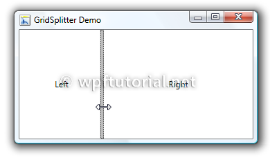
width or height when you drag this control around.<Grid> <Grid.ColumnDefinitions> <ColumnDefinition Width="*"/> <ColumnDefinition Width="Auto"/> <ColumnDefinition Width="*"/> </Grid.ColumnDefinitions> <Label Content="Left" Grid.Column="0" /> <GridSplitter HorizontalAlignment="Right" VerticalAlignment="Stretch" Grid.Column="1" ResizeBehavior="PreviousAndNext" Width="5" Background="#FFBCBCBC"/> <Label Content="Right" Grid.Column="2" /> </Grid>
ResizeBehavior to PreviousAndNext.The splitter normally recognizes the resize direction according to the ratio between its height and width. But if you like you can also manually set the
ResizeDirection to Columns or Rows.
<GridSplitter ResizeDirection="Columns"/>
How to share the width of a column over multiple grids
The shared size feature of the grid layout allows it to synchronize the width of columns over multiple grids. The feature is very useful if you want to realize a multi-column listview by using a grid as layout panel within the data template. Because each item contains its own grid, the columns will not have the same width.By setting the attached property
Grid.IsSharedSizeScope to true on a parent element you define a scope within the column-widths are shared.To synchronize the width of two columndefinitions, set the
SharedSizeGroup to the same name.<ItemsControl Grid.IsSharedSizeScope="True" > <ItemsControl.ItemTemplate> <DataTemplate> <Grid> <Grid.ColumnDefinitions> <ColumnDefinition SharedSizeGroup="FirstColumn" Width="Auto"/> <ColumnDefinition Width="*"/> </Grid.ColumnDefinitions> <TextBlock Text="{Binding Path=Key}" TextWrapping="Wrap"/> <TextBlock Text="{Binding Path=Value}" Grid.Column="1" TextWrapping="Wrap"/> </Grid> </DataTemplate> </ItemsControl.ItemTemplate> </ItemsControl>
Useful Hints
Columns and rows that participate in size-sharing do not respect Star sizing. In the size-sharing scenario, Star sizing is treated as Auto. Since TextWrapping on TextBlocks within an SharedSize column does not work you can exclude your last column from the shared size. This often helps to resolve the problem.Using GridLenghts from code
If you want to add columns or rows by code, you can use theGridLength class to define the differenz types of sizes.| Auto sized | GridLength.Auto
|
| Star sized | new GridLength(1,GridUnitType.Star) |
| Fixed size | new GridLength(100,GridUnitType.Pixel) |
Grid grid = new Grid();

ColumnDefinition col1 = new ColumnDefinition();
col1.Width = GridLength.Auto;
ColumnDefinition col2 = new ColumnDefinition();
col2.Width = new GridLength(1,GridUnitType.Star);

grid.ColumnDefinitions.Add(col1);
grid.ColumnDefinitions.Add(col2);


No comments:
Post a Comment