

Control Templates
Introduction
Controls in WPF are separated into logic, that defines the states, events and properties and template, that defines the visual appearance of the control. The wireup between the logic and the template is done by DataBinding.Each control has a default template. This gives the control a basic appearance. The default template is typically shipped together with the control and available for all common windows themes. It is by convention wrapped into a style, that is identified by value of the
DefaultStyleKey property that every control has.The template is defined by a dependency property called
Template.
By setting this property to another instance of a control template, you
can completely replace the appearance (visual tree) of a control.
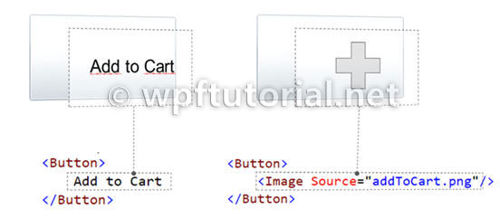
The control template is often included in a style that contains other property settings. The following code sample shows a simple control template for a button with an ellipse shape.
<Style x:Key="DialogButtonStyle" TargetType="Button">
    <Setter Property="Template">
        <Setter.Value>
            <ControlTemplate TargetType="{x:Type Button}">
                <Grid>
                    <Ellipse Fill="{TemplateBinding Background}"
                             Stroke="{TemplateBinding BorderBrush}"/>
                        <ContentPresenter HorizontalAlignment="Center"
                                          VerticalAlignment="Center"/>
                </Grid>
            </ControlTemplate>
        </Setter.Value>
    </Setter>
</Style>
<Button Style="{StaticResource DialogButtonStyle}" />

A Button without and with a custom control template
ContentPresenter
When you create a custom control template and you want to define a placeholder that renders the content, you can use theContentPresenter. By default it adds the content of the Content property to the visual tree of the template. To display the content of another property you can set the ContentSource to the name of the property you like.
Triggers

{RelativeSource TemplatedParent} not working in DataTriggers of  a ControlTemplate
If you want to bind to a property of a property on your control like Data.IsLoaded you cannot use a normal Trigger, since it does not support this notation, you have to use a DataTrigger.


But when you are using a DataTrigger, with {RelativeSource TemplatedParent} it will not work. The reason is, that TemplatedParent can only be used within the ControlTemplate. It is not working in the Trigger section. You have to use the {RelativeSource Self} instead.


What if a Binding working or a Setter is not applied when using a control template
There is something you need to know when setting a value of an
element within a control template: The value does have a lower
precendence as the local value! So if you are setting the local value in
 the constructor of the contained element, you cannot override it within
 the controltemplate. But if you use the element directly in your view,
it will work. So be aware of this behavior!.


Here you can find more information about DependencyProperty value precendence: Dependency Property Value Precedence
No comments:
Post a Comment