

In this tutorial you will learn how to use Bootstrap button group component.
Creating Button Group with Bootstrap
In the previous chapter you've learnt how to create different types of individual buttons and modify them with predefined classes. Bootstrap however, also allows you to group a series of buttons together in a single line through the button group component.
To create a button groups just wrap a series of buttons in a
<div> element and apply the class .btn-group on it, like shown in the example below:Example
.<div class="btn-group">
<button type="button" class="btn btn-primary">Left</button>
<button type="button" class="btn btn-primary">Middle</button>
<button type="button" class="btn btn-primary">Right</button>
</div>
— The output of the above example will look something like this:
You can also make the button groups appear vertically stacked rather than horizontally. To do this just replace the class
.btn-group with the .btn-group-vertical.Example
.<div class="btn-group-vertical">
<button type="button" class="btn btn-primary">Top</button>
<button type="button" class="btn btn-primary">Middle</button>
<button type="button" class="btn btn-primary">Bottom</button>
</div>
Creating Button Toolbar
You can also combine sets of button groups together for creating more complex components like button toolbar. To create button toolbar just wrap sets of button groups in a
<div>element and apply the class .btn-toolbar on it.Example
.<div class="btn-toolbar">
<div class="btn-group">
<button type="button" class="btn btn-primary">1</button>
<button type="button" class="btn btn-primary">2</button>
<button type="button" class="btn btn-primary">3</button>
<button type="button" class="btn btn-primary">4</button>
</div><div class="btn-group">
<button type="button" class="btn btn-primary">5</button>
<button type="button" class="btn btn-primary">6</button>
<button type="button" class="btn btn-primary">7</button>
</div><div class="btn-group">
<button type="button" class="btn btn-primary">8</button>
</div></div>
— The output of the above example will look something like this:
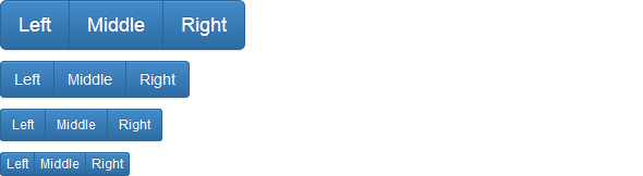
Height Sizing of Button Groups
You can also apply relative sizing classes like
.btn-group-lg, .btn-group-sm or .btn-group-xs on button groups to create larger or smaller button groups. Just add these button sizing classes directly to the .btn-group, instead of applying to every button.Example
.<div class="btn-toolbar">
<div class="btn-group btn-group-lg">
<button type="button" class="btn btn-primary">Left</button>
<button type="button" class="btn btn-primary">Middle</button>
<button type="button" class="btn btn-primary">Right</button>
</div></div><div class="btn-toolbar">
<div class="btn-group">
<button type="button" class="btn btn-primary">Left</button>
<button type="button" class="btn btn-primary">Middle</button>
<button type="button" class="btn btn-primary">Right</button>
</div></div><div class="btn-toolbar">
<div class="btn-group btn-group-sm">
<button type="button" class="btn btn-primary">Left</button>
<button type="button" class="btn btn-primary">Middle</button>
<button type="button" class="btn btn-primary">Right</button>
</div></div><div class="btn-toolbar">
<div class="btn-group btn-group-xs">
<button type="button" class="btn btn-primary">Left</button>
<button type="button" class="btn btn-primary">Middle</button>
<button type="button" class="btn btn-primary">Right</button>
</div></div>
— The output of the above example will look something like this:
Creating Justified Button Groups
You can also make a group of buttons stretch at the same size to span the entire width of its parent by appling an extra class
.btn-group-justified to the .btn-group base class.
The following example will create a justified button group using the
<a> element.Example
.<div class="btn-group btn-group-justified">
<a href="#" class="btn btn-primary">Left</a>
<a href="#" class="btn btn-primary">Middle</a>
<a href="#" class="btn btn-primary">Right</a>
</div>
— The output of the above example will look something like this:
However, to create justified button groups using the
<button> elements, you must wrap each button individually in a .btn-group class, otherwise it will not work.Example
.<div class="btn-group btn-group-justified">
<div class="btn-group">
<button type="button" class="btn btn-primary">Left</button>
</div><div class="btn-group">
<button type="button" class="btn btn-primary">Middle</button>
</div><div class="btn-group">
<button type="button" class="btn btn-primary">Right</button>
</div></div>
The story doesn't ends here; in the advanced section you'll learn how createbutton dropdowns as well as stateful buttons through activating the toggling and loading state on simple buttons and the button groups component.