

In this tutorial you will learn how to create elegant tables with Bootstrap.
What is Table
The HTML tables are used to present data in grid manner like row and columns. Using Bootstrap you can greatly improve the appearance of table in a simple way.
See the tutorial on HTML Tables to learn more about tables.
Creating a Simple Table with Bootstrap
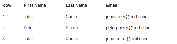
You can create tables with basic styling that has horizontal dividers and small cell padding (
8px by default), by just adding the Bootstrap's class .table to the <table> element.Example
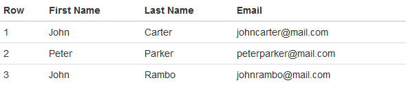
.<table class="table">
<thead><tr><th>Row</th>
<th>First Name</th>
<th>Last Name</th>
<th>Email</th>
</tr></thead><tbody><tr><td>1</td>
<td>John</td>
<td>Carter</td>
<td>johncarter@mail.com</td>
</tr><tr><td>2</td>
<td>Peter</td>
<td>Parker</td>
<td>peterparker@mail.com</td>
</tr><tr><td>3</td>
<td>John</td>
<td>Rambo</td>
<td>johnrambo@mail.com</td>
</tr></tbody></table>
— The output of the above example will look something like this:
Tables with Alternate Background
You can create table with alternate background like zebra-strips by simply adding the Bootstrap's class
.table-striped to the .table base class.
This is achieved by adding the background-color to the table row within
<tbody> element via the :nth-child CSS selector (not supported in IE7-8).Example
.<table class="table table-striped">
<thead><tr><th>Row</th>
<th>First Name</th>
<th>Last Name</th>
<th>Email</th>
</tr></thead><tbody><tr><td>1</td>
<td>John</td>
<td>Carter</td>
<td>johncarter@mail.com</td>
</tr><tr><td>2</td>
<td>Peter</td>
<td>Parker</td>
<td>peterparker@mail.com</td>
</tr><tr><td>3</td>
<td>John</td>
<td>Rambo</td>
<td>johnrambo@mail.com</td>
</tr></tbody></table>
— The output of the above example will look something like this:
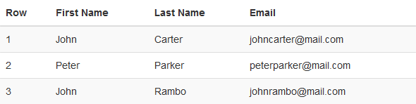
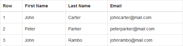
Table with Borders
You can also add borders to the all table cells by adding an extra Bootstrap's class
.table-bordered to the .table base class.Example
.<table class="table table-bordered">
<thead><tr><th>Row</th>
<th>First Name</th>
<th>Last Name</th>
<th>Email</th>
</tr></thead><tbody><tr><td>1</td>
<td>John</td>
<td>Carter</td>
<td>johncarter@mail.com</td>
</tr><tr><td>2</td>
<td>Peter</td>
<td>Parker</td>
<td>peterparker@mail.com</td>
</tr><tr><td>3</td>
<td>John</td>
<td>Rambo</td>
<td>johnrambo@mail.com</td>
</tr></tbody></table>
— The output of the above example will look something like this:
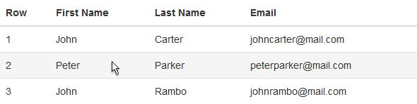
Enable Hover State on Table Rows
You can also enable a hover state on table rows within a
<tbody> element by adding the Bootstrap's class .table-hover to the .table base class.Example
.<table class="table table-hover">
<thead><tr><th>Row</th>
<th>First Name</th>
<th>Last Name</th>
<th>Email</th>
</tr></thead><tbody><tr><td>1</td>
<td>John</td>
<td>Carter</td>
<td>johncarter@mail.com</td>
</tr><tr><td>2</td>
<td>Peter</td>
<td>Parker</td>
<td>peterparker@mail.com</td>
</tr><tr><td>3</td>
<td>John</td>
<td>Rambo</td>
<td>johnrambo@mail.com</td>
</tr></tbody></table>
— The output of the above example will look something like this:
Condensed or Compact Table
You can also make your tables more compact and save the space through adding an extra class
.table-condensed to the .table base class. The class .table-condensed makes the table compact by cutting the cell padding in half.Example
.<table class="table table-condensed">
<thead><tr><th>Row</th>
<th>First Name</th>
<th>Last Name</th>
<th>Email</th>
</tr></thead><tbody><tr><td>1</td>
<td>John</td>
<td>Carter</td>
<td>johncarter@mail.com</td>
</tr><tr><td>2</td>
<td>Peter</td>
<td>Parker</td>
<td>peterparker@mail.com</td>
</tr><tr><td>3</td>
<td>John</td>
<td>Rambo</td>
<td>johnrambo@mail.com</td>
</tr></tbody></table>
— The output of the above example will look something like this:
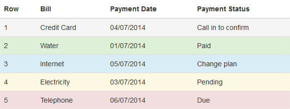
Optional Emphasis Classes for Table Rows
There are some contextual classes to emphasize the row or individual cells data like success, warning, danger, etc. through coloring its background.
Example
.<table class="table">
<thead><tr><th>Row</th>
<th>Bill</th>
<th>Payment Date</th>
<th>Payment Status</th>
</tr></thead><tbody><tr class="active">
<td>1</td>
<td>Credit Card</td>
<td>04/07/2014</td>
<td>Call in to confirm</td>
</tr><tr class="success">
<td>2</td>
<td>Water</td>
<td>01/07/2014</td>
<td>Paid</td>
</tr><tr class="info">
<td>3</td>
<td>Internet</td>
<td>05/07/2014</td>
<td>Change plan</td>
</tr><tr class="warning">
<td>4</td>
<td>Electricity</td>
<td>03/07/2014</td>
<td>Pending</td>
</tr><tr class="danger">
<td>5</td>
<td>Telephone</td>
<td>06/07/2014</td>
<td>Due</td>
</tr></tbody></table>
— The output of the above example will look something like this:
Creating Responsive Tables with Bootstrap
With Bootstrap 3 you can also create responsive tables to enable horizontal scrolling on small devices (screen width under
768px). However, viewing responsive tables on other devices having screen width larger than 768px, you will not see any difference.
To make any table responsive just place the table inside a
<div> element and apply the class .table-responsive on it, as demonstrated in the example below:Example
.<div class="table-responsive">
<table class="table table-bordered">
<thead><tr><th>Row</th>
<th>First Name</th>
<th>Last Name</th>
<th>Email</th>
<th>Biography</th>
</tr></thead><tbody><tr><td>1</td>
<td>John</td>
<td>Carter</td>
<td>johncarter@mail.com</td>
<td>Lorem ipsum dolor sit amet…</td>
</tr><tr><td>2</td>
<td>Peter</td>
<td>Parker</td>
<td>peterparker@mail.com</td>
<td>Vestibulum consectetur scelerisque…</td>
</tr><tr><td>3</td>
<td>John</td>
<td>Rambo</td>
<td>johnrambo@mail.com</td>
<td>Integer pulvinar leo id risus…</td>
</tr></tbody></table></div>
Supported Table Elements in Bootstrap
The following table lists the supported HTML table elements and how they should be used.
| Tag | Description |
|---|---|
<table> | Wrapper element for displaying data in a tabular format. |
<caption> | The title or summary of what the table holds. |
<thead> | Container element for table header rows (<tr>) defines headings for table columns. |
<tbody> | Container element for table rows (<tr>) that defines the body of a table. |
<tr> | Container element for a set of table cells (<td> or <th>) that appears in a single row. |
<th> | Special table cell for column headings. |
<td> | Default table cell for placing data. |
No comments:
Post a Comment