

In this tutorial you will learn how to style HTML lists with Bootstrap.
Creating Lists With Bootstrap
You can define the three different types of lists:
- Unordered lists — A list of items in which the order does not explicitly matter. The list items in unordered lists are marked with bullets.
- Ordered lists — A list of items in which the order does explicitly matter. The list items in ordered lists are marked with numbers.
- Definition list — A list of terms with their associated descriptions.
See the tutorial on HTML Lists, to learn more about different lists types.
Unstyled Ordered and Unordered Lists
Sometimes you might need to remove the default styling form the list items. You can do this by simply applying the class
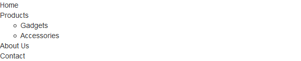
.list-unstyled to the respective <ul> or <ol> elements.Example
<ul class="list-unstyled">
<li>Home</li>
<li>Products<ul><li>Gadgets</li>
<li>Accessories</li>
</ul></li><li>About Us</li>
<li>Contact</li>
</ul>
— The output of the above example will look something like this:
Note:The
.list-unstyled class removes the default list-style and left paddingonly from the list items which are immediate children of the <ul> or <ol> element.Placing Ordered and Unordered List Items Inline
If you want to create a horizontal menu using ordered or unordered list you need to place all list items in a single line i.e. side by side. You can do this by simply applying the Bootstrap's class
.list-inline to the respective <ul> or <ol> elements. The .list-inline class also adds some left and right padding (5px by default) to the all list items.Example
.<ul class="list-inline">
<li>Home</li>
<li>Products</li>
<li>About Us</li>
<li>Contact</li>
</ul>
— The output of the above example will look something like this:
Creating Horizontal Definition Lists
The terms and descriptions in definition lists can also be placed side-by-side using the Bootstrap's class
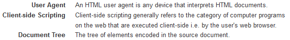
.dl-horizontal. The terms in horizontal definition lists will be truncated if is too long to fit in the left column (160px by default), however in narrower viewports they will change to the default stacked layout.Example
.<dl class="dl-horizontal">
<dt>User Agent</dt>
<dd>An HTML user agent is any device that interprets HTML documents.</dd>
<dt>Client-side Scripting</dt>
<dd>Client-side scripting generally refers to the category of computer programs on the web that are executed client-side i.e. by the user's web browser.</dd>
<dt>Document Tree</dt>
<dd>The tree of elements encoded in the source document.</dd>
</dl>
— The output of the above example will look something like this:
Note:The terms clipped in horizontal definition lists will be indicated by an ellipsis (…) using the
text-overflow CSS property.
In the next chapter you will learn how to create even more flexible and complex list of elements using the Bootstrap list group component.
No comments:
Post a Comment