

In this tutorial you will learn how to create and modify buttons with Bootstrap.
Creating Buttons with Bootstrap
Buttons are the integral part of a website and application. They are used for various purposes like, submit or reset an HTML form, performing interactive actions such as showing or hiding something on a web page on click of the button, etc. The Bootstrap button CSS provides the quick and easy way to create and customize the buttons.
Bootstrap Button Styles
Different classes are available in Bootstrap for styling the buttons as well as to indicate the different states. Button styles can be applied to any element. However, it is applied normally to the
<a>, <input>, and <button> elements for the best rendering.
The following table lists the different buttons which are available in the Bootstrap:
| Button | Class | Description |
|---|---|---|
 | | Default gray button with gradient. |
 | btn btn-primary | Provides extra visual weight to indicate primary action button in a set of buttons. |
 | btn btn-info | Can be used as an alternative to the default button. |
 | btn btn-success | Indicates a successful or positive action. |
 | btn btn-warning | Indicates caution should be taken with this action. |
 | btn btn-danger | Indicates a dangerous or potentially negative action. |
 | btn btn-link | Deemphasize a button by making it look like a link while maintaining button behavior. |
The following example will show you these buttons in action.
Example
.<button type="button" class="btn btn-default">Default</button>
<button type="button" class="btn btn-primary">Primary</button>
<button type="button" class="btn btn-info">Info</button>
<button type="button" class="btn btn-success">Success</button>
<button type="button" class="btn btn-warning">Warning</button>
<button type="button" class="btn btn-danger">Danger</button>
<button type="button" class="btn btn-link">Link</button>
Warning:Internet Explorer 9 doesn't crop background gradients on rounded corners, so gradient is removed from buttons.
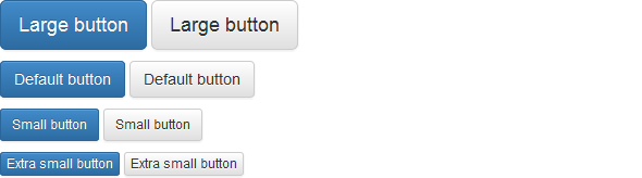
Changing the Sizes of Buttons
Bootstrap gives you option further to scaling a button up or down. You can a make buttons larger or smaller through adding an extra class
.btn-lg, .btn-sm, or .btn-xs.Example
.<p><button type="button" class="btn btn-primary btn-lg">Large button</button>
<button type="button" class="btn btn-default btn-lg">Large button</button>
</p><p><button type="button" class="btn btn-primary">Default button</button>
<button type="button" class="btn btn-default">Default button</button>
</p><p><button type="button" class="btn btn-primary btn-sm">Small button</button>
<button type="button" class="btn btn-default btn-sm">Small button</button>
</p><p><button type="button" class="btn btn-primary btn-xs">Extra small button</button>
<button type="button" class="btn btn-default btn-xs">Extra small button</button>
</p>
— The output of the above example will look something like this:
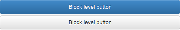
You can also create block level buttons (buttons that covers the full width of the parent elements) by adding an extra class
.btn-block.Example
.<button type="button" class="btn btn-primary btn-lg btn-block">Block level button</button>
<button type="button" class="btn btn-default btn-lg btn-block">Block level button</button>
— The output of the above example will look something like this:
Bootstrap Disabled Buttons
Sometimes we need to disable a button for certain reasons like, a user in case is not eligible to perform this particular action, or we want to ensure that user should performed all other required actions before proceed to this particular action.
Creating Disabled Buttons Using Anchor Elements
Buttons created through
<a> tag can be disabled by adding the class .disabled.Example
.<a href="#" class="btn btn-primary btn-lg disabled">Primary link</a>
<a href="#" class="btn btn-default btn-lg disabled">Link</a>
— The output of the above example will look something like this:
Note:The
.disabled class only changes the visual appearance of the link by making it gray and removing the hover effect, however the link will remain clickable unless you remove the "href" attribute. Alternatively, you could implement custom JavaScript to prevent those clicks.Creating Disabled Buttons Using Button and Input Element
Buttons created through
<button> or <input> tag can be disabled by adding the "disabled"attribute to the respective element.Example
.<button type="button" class="btn btn-primary btn-lg disabled" disabled="disabled">Primary button</button>
<button type="button" class="btn btn-default btn-lg" disabled="disabled">Button</button>
— The output of the above example will look something like this:
In the next chapter you will learn how to combine multiple buttons horizontally or vertically in a line like toolbars using the Bootstrap button groups component.
No comments:
Post a Comment