

In this tutorial you will learn how to create responsive web designs or layouts with Bootstrap framework.
What is Responsive Web Design or Layout
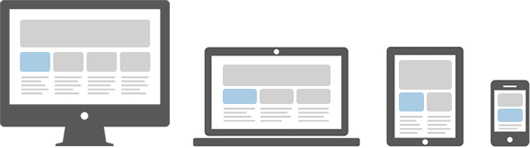
Responsive web design is a process of designing and building websites to provide better accessibility and optimal viewing experience to the user.
With the growing trend of smart phones and tablets, it has become almost unavoidable to ignore the optimization of sites for mobile devices. Responsive web design is a preferable alternative and an efficient way to target a wide range of devices with much less efforts.
Responsive layouts automatically adjust and adapts to any device screen size, whether it is a desktop, a laptop, a tablet, or a mobile phone.
Creating Responsive Layout with Bootstrap
With the new Bootstrap 3 mobile first grid system creating the responsive and mobile friendly websites has become much easier. As opposed to previous version you don't need to include any additional style sheet to enable responsive feature. Bootstrap 3 is responsive and mobile friendly from the start. Its four tiers grids classes provides better control over the layout as well as how it will be rendered on different types of devices like cell phones, tablets, desktop and laptops, large screen devices etc.
Example
.<html lang="en">
<head><meta charset="utf-8">
<title>Bootstrap 3 Responsive Layout Example</title>
<link rel="stylesheet" type="text/css" href="css/bootstrap.min.css">
<link rel="stylesheet" type="text/css" href="css/bootstrap-theme.min.css">
<script type="text/javascript" src="https://code.jquery.com/jquery-1.11.2.min.js"></script>
<script type="text/javascript" src="js/bootstrap.min.js"></script>
</head><body><nav id="myNavbar" class="navbar navbar-default navbar-inverse navbar-fixed-top" role="navigation">
<!-- Brand and toggle get grouped for better mobile display --><div class="container">
<div class="navbar-header">
<button type="button" class="navbar-toggle" data-toggle="collapse" data-target="#navbarCollapse">
<span class="sr-only">Toggle navigation</span>
<span class="icon-bar"></span>
<span class="icon-bar"></span>
<span class="icon-bar"></span>
</button><a class="navbar-brand" href="#">Tutorial Republic</a>
</div><!-- Collect the nav links, forms, and other content for toggling --><div class="collapse navbar-collapse" id="navbarCollapse">
<ul class="nav navbar-nav">
<li class="active"><a href="http://dotnetmasterindia.blogspot.in/" target="_blank">Home</a></li>
<li><a href="http://dotnetmasterindia.blogspot.in/" target="_blank">About</a></li>
<li><a href="http://dotnetmasterindia.blogspot.in/" target="_blank">Contact</a></li>
</ul></div></div></nav><div class="container">
<div class="jumbotron">
<h1>Learn to Create Websites</h1>
<p>In today's world internet is the most popular way of connecting with the people. At <a href="http://dotnetmasterindia.blogspot.in/" target="_blank">dotnetmasterindia.blogspot.in</a> you will learn the essential of web development technologies along with real life practice example, so that you can create your own website to connect with the people around the world.</p>
<p><a href="http://dotnetmasterindia.blogspot.in/" target="_blank" class="btn btn-success btn-lg">Get started today</a></p>
</div><div class="row">
<div class="col-sm-6 col-md-4 col-lg-2">
<h2>HTML</h2>
<p>HTML is a markup language that is used for creating web pages. The HTML tutorial section will help you understand the basics of HTML, so that you can create your own web pages or website.</p>
<p><a href="http://dotnetmasterindia.blogspot.in/" target="_blank" class="btn btn-success">Learn More »</a></p>
</div><div class="col-sm-6 col-md-4 col-lg-2">
<h2>CSS</h2>
<p>CSS is used for describing the presentation of web pages. The CSS tutorial section will help you learn the essentials of CSS, so that you can fine control the style and layout of your HTML document.</p>
<p><a href=http://dotnetmasterindia.blogspot.in/" target="_blank" class="btn btn-success">Learn More »</a></p>
</div><div class="clearfix visible-sm-block"></div>
<div class="col-sm-6 col-md-4 col-lg-2">
<h2>Bootstrap</h2>
<p>Bootstrap is a powerful front-end framework for faster and easier web development. The Bootstrap tutorial section will help you learn the techniques of Bootstrap so that you can create web your own website with much less efforts.</p>
<p><a href="http://dotnetmasterindia.blogspot.in/" target="_blank" class="btn btn-success">Learn More »</a></p>
</div><div class="clearfix visible-md-block"></div>
<div class="col-sm-6 col-md-4 col-lg-2">
<h2>References</h2>
<p>The references section outlines all the standard HTML tags and CSS properties along with other useful references such as color names and values, symbols and character entities, web safe fonts, language codes, HTTP messages and much more.</p>
<p><a href="http://dotnetmasterindia.blogspot.in/" target="_blank" class="btn btn-success">Learn More »</a></p>
</div><div class="clearfix visible-sm-block"></div>
<div class="col-sm-6 col-md-4 col-lg-2">
<h2>Examples</h2>
<p>The examples section encloses an extensive collection of examples on various topic that you can try and test yourself using online HTML editor.</p>
<p><a href="http://dotnetmasterindia.blogspot.in/" target="_blank" class="btn btn-success">Learn More »</a></p>
</div><div class="col-sm-6 col-md-4 col-lg-2">
<h2>FAQ</h2>
<p>The collection of Frequently Asked Questions (FAQ) provides brief answers to many common questions related to web design and development.</p>
<p><a href="http://dotnetmasterindia.blogspot.in/" target="_blank" class="btn btn-success">Learn More »</a></p>
</div></div><hr><div class="row">
<div class="col-sm-12">
<footer><p>© Copyright 2013 dotnetmasterindia.blogspot.in</p>
</footer></div></div></div></body></html>
Tip:Open the output of this example in new window and resize the screen you will see the orientation of content boxes changes when viewport width crossing or approaching the certain limit (i.e. breakpoints).
No comments:
Post a Comment