

In this tutorial you will learn how to create elegant forms with Bootstrap.
Creating Forms with Bootstrap
HTML forms are the integral part of the web pages and applications, but styling the form controls manually one by one with CSS are often boring and tedious. Bootstrap greatly simplifies the process of styling and alignment of form controls like labels, input fields, selectboxes, textareas, buttons, etc. through predefined set of classes.
Bootstrap provides three different types of form layouts:
- Vertical Form (default form layout)
- Horizontal Form
- Inline Form
The following section will give you the detailed overview of these form layouts as well as the various form related Bootstrap components one by one.
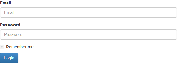
Creating Vertical Form Layout
This is the default Bootstrap form layout in which styles are applied to form controls without adding any base class to the
<form> element or any large changes in the markup.
The form controls in this layout are stacked with left-aligned labels on the top.
Example
.<form><div class="form-group">
<label for="inputEmail">Email</label>
<input type="email" class="form-control" id="inputEmail" placeholder="Email">
</div><div class="form-group">
<label for="inputPassword">Password</label>
<input type="password" class="form-control" id="inputPassword" placeholder="Password">
</div><div class="checkbox">
<label><input type="checkbox"> Remember me</label>
</div><button type="submit" class="btn btn-primary">Login</button>
</form>
— The output of the above example will look something like this:
Note:In Bootstrap 3 all textual elements like
<input>, <textarea>, and <select>with the class .form-control are 100% wide by default. To use them inline, you'll have to set a width on the element the form controls used within.Creating Horizontal Form Layout
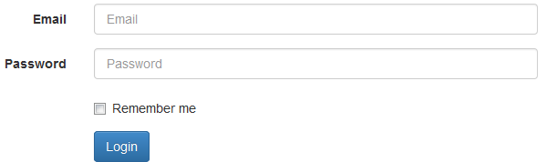
In horizontal form layout labels are right aligned and floated to left to make them appear on the same line as form controls. The horizontal form layout requires the various markup changes from a default form layout. Steps to achieve this layout are listed below:
- Add the class
.form-horizontalto the<form>element. - Wrap labels and form controls in a
<div>element and apply the class.form-group. - Use Bootstrap's predefined grid classes to align labels and form controls.
- Add the class
.control-labelto the<label>element.
Example
.<form class="form-horizontal">
<div class="form-group">
<label for="inputEmail" class="control-label col-xs-2">Email</label>
<div class="col-xs-10">
<input type="email" class="form-control" id="inputEmail" placeholder="Email">
</div></div><div class="form-group">
<label for="inputPassword" class="control-label col-xs-2">Password</label>
<div class="col-xs-10">
<input type="password" class="form-control" id="inputPassword" placeholder="Password">
</div></div><div class="form-group">
<div class="col-xs-offset-2 col-xs-10">
<div class="checkbox">
<label><input type="checkbox"> Remember me</label>
</div></div></div><div class="form-group">
<div class="col-xs-offset-2 col-xs-10">
<button type="submit" class="btn btn-primary">Login</button>
</div></div></form>
— The output of the above example will look something like this:
Creating Inline Form Layout
Sometimes you might require to place the form controls side-by-side to compact the layout. You can do this easily by adding the Bootstrap class
.form-inline to the <form> element.Example
.<form class="form-inline">
<div class="form-group">
<label class="sr-only" for="inputEmail">Email</label>
<input type="email" class="form-control" id="inputEmail" placeholder="Email">
</div><div class="form-group">
<label class="sr-only" for="inputPassword">Password</label>
<input type="password" class="form-control" id="inputPassword" placeholder="Password">
</div><div class="checkbox">
<label><input type="checkbox"> Remember me</label>
</div><button type="submit" class="btn btn-primary">Login</button>
</form>
— The output of the above example will look something like this:

Note:It is recommended to include a label for every form inputs otherwise screen readers will have trouble with your forms. However in case of inline form layout you can hide these labels using the
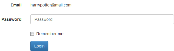
.sr-only class.Static Form Control
There might be a situation when you need to place just plain text next to a form label instead of a form control. You can do this within a horizontal form layout by using the
.form-control-static class on a <p> element, like this:Example
.<form class="form-horizontal">
<div class="form-group">
<label for="inputEmail" class="control-label col-xs-2">Email</label>
<div class="col-xs-10">
<p class="form-control-static">harrypotter@mail.com</p>
</div></div><div class="form-group">
<label for="inputPassword" class="control-label col-xs-2">Password</label>
<div class="col-xs-10">
<input type="password" class="form-control" id="inputPassword" placeholder="Password">
</div></div><div class="form-group">
<div class="col-xs-offset-2 col-xs-10">
<div class="checkbox">
<label><input type="checkbox"> Remember me</label>
</div></div></div><div class="form-group">
<div class="col-xs-offset-2 col-xs-10">
<button type="submit" class="btn btn-primary">Login</button>
</div></div></form>
— The output of the above example will look something like this:
Height Sizing of Inputs and Select Boxes
You can easily control the height of your input and select boxes to match the button sizes. The Bootstrap's relative sizing classes like
.input-lg, .input-sm can be used both on<input> and <select> boxes to create it's larger or smaller sizes.Example
.<form><div class="row">
<div class="col-xs-6">
<input type="text" class="form-control input-lg" placeholder="Large input">
</div><div class="col-xs-6">
<select class="form-control input-lg">
<option>Large select</option>
</select></div></div><br><div class="row">
<div class="col-xs-6">
<input type="text" class="form-control" placeholder="Default input">
</div><div class="col-xs-6">
<select class="form-control">
<option>Default select</option>
</select></div></div><br><div class="row">
<div class="col-xs-6">
<input type="text" class="form-control input-sm" placeholder="Small input">
</div><div class="col-xs-6">
<select class="form-control input-sm">
<option>Small select</option>
</select></div></div></form>
Column Sizing of Inputs, Textareas and Select Boxes
You can also match the sizes of your form controls to the Bootstrap grid column sizes. Just wrap your form controls (i.e.
<input>, <textarea>, and <select>) in grid columns, or any custom element and apply the grid classes on it.Example
.<form><div class="row">
<div class="col-xs-3">
<input type="text" class="form-control">
</div><div class="col-xs-4">
<input type="text" class="form-control">
</div><div class="col-xs-5">
<input type="text" class="form-control">
</div></div><br><div class="row">
<div class="col-xs-3">
<textarea class="form-control"></textarea>
</div><div class="col-xs-4">
<textarea class="form-control"></textarea>
</div><div class="col-xs-5">
<textarea class="form-control"></textarea>
</div></div><br><div class="row">
<div class="col-xs-3">
<select class="form-control">
<option>Select</option>
</select></div><div class="col-xs-4">
<select class="form-control">
<option>Select</option>
</select></div><div class="col-xs-5">
<select class="form-control">
<option>Select</option>
</select></div></div></form>
Height Sizing of Form Groups
You can add the relative form sizing classes such as
.form-group-lg or .form-group-sm to the .form-group itself to make both the labels and form controls larger or smaller at the same time within the horizontal form layouts.Example
.<form class="form-horizontal">
<div class="form-group form-group-lg">
<label class="col-sm-3 control-label" for="inputLarge">Large label</label>
<div class="col-sm-9">
<input type="text" class="form-control" id="inputLarge" placeholder="Large input">
</div></div><div class="form-group">
<label class="col-sm-3 control-label" for="inputDefault">Default label</label>
<div class="col-sm-9">
<input type="text" class="form-control" id="inputDefault" placeholder="Default input">
</div></div><div class="form-group form-group-sm">
<label class="col-sm-3 control-label" for="inputSmall">Small label</label>
<div class="col-sm-9">
<input type="text" class="form-control" id="inputSmall" placeholder="Small input">
</div></div></form>
Creating Disabled and Readonly Inputs
To create disabled inputs just add the attributes
disabled to the <input> element and Bootstrap will do the rest.Example
.<form><input type="text" class="form-control" placeholder="Disabled input" disabled="disabled">
</form>
— The output of the above example will look something like this:
Similarly, you can add the
readonly attribute on input elements to create read only input controls that prevent user inputs and give the style same as disabled.Example
.<form><input type="text" class="form-control" placeholder="Readonly input" readonly="readonly">
</form>
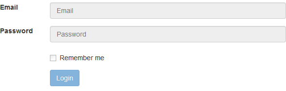
Creating Disabled Fieldsets
Rather than disabling the form controls individually, you can also disable all form controls within a fieldset at once by adding the
disabled attribute to the <fieldset> element.Example
.<form class="form-horizontal">
<fieldset disabled="disabled">
<div class="form-group">
<label for="inputEmail" class="control-label col-xs-2">Email</label>
<div class="col-xs-10">
<input type="email" class="form-control" id="inputEmail" placeholder="Email">
</div></div><div class="form-group">
<label for="inputPassword" class="control-label col-xs-2">Password</label>
<div class="col-xs-10">
<input type="password" class="form-control" id="inputPassword" placeholder="Password">
</div></div><div class="form-group">
<div class="col-xs-offset-2 col-xs-10">
<div class="checkbox">
<label><input type="checkbox"> Remember me</label>
</div></div></div><div class="form-group">
<div class="col-xs-offset-2 col-xs-10">
<button type="submit" class="btn btn-primary">Login</button>
</div></div></fieldset></form>
— The output of the above example will look something like this:
Placing Help Text around Form Controls
Placing help text for the form controls in an efficient way to guide users to enter the correct data in a form. You can place block level help text for the form controls using the class
.help-block. The help text is typically displayed at the bottom of the control.Example
.<form><input type="text" class="form-control">
<span class="help-block">A block of help text that breaks onto a new line and may extend beyond one line.</span>
</form>
— The output of the above example will look something like this:

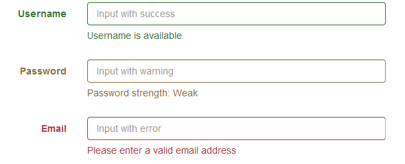
Bootstrap Form Validation States
Bootstrap provides easy to use and powerful mechanism for styling input controls to present different validation states. Bootstrap includes validation styles for error, warning, and success messages. To use, just add the appropriate class to the surrounding
.form-group.Example
.<form class="form-horizontal">
<div class="form-group has-success">
<label class="col-xs-2 control-label" for="inputSuccess">Username</label>
<div class="col-xs-10">
<input type="text" id="inputSuccess" class="form-control" placeholder="Input with success">
<span class="help-block">Username is available</span>
</div></div><div class="form-group has-warning">
<label class="col-xs-2 control-label" for="inputWarning">Password</label>
<div class="col-xs-10">
<input type="password" id="inputWarning" class="form-control" placeholder="Input with warning">
<span class="help-block">Password strength: Weak</span>
</div></div><div class="form-group has-error">
<label class="col-xs-2 control-label" for="inputError">Email</label>
<div class="col-xs-10">
<input type="email" id="inputError" class="form-control" placeholder="Input with error">
<span class="help-block">Please enter a valid email address</span>
</div></div></form>
— The output of the above example will look something like this:
You can also add optional feedback icons to your inputs using the class
.has-feedback on.form-group and the right glyphicon, like this:Example
.<form class="form-horizontal">
<div class="form-group has-success has-feedback">
<label class="col-xs-2 control-label" for="inputSuccess">Username</label>
<div class="col-xs-10">
<input type="text" id="inputSuccess" class="form-control" placeholder="Input with success">
<span class="glyphicon glyphicon-ok form-control-feedback"></span>
<span class="help-block">Username is available</span>
</div></div><div class="form-group has-warning has-feedback">
<label class="col-xs-2 control-label" for="inputWarning">Password</label>
<div class="col-xs-10">
<input type="password" id="inputWarning" class="form-control" placeholder="Input with warning">
<span class="glyphicon glyphicon-warning-sign form-control-feedback"></span>
<span class="help-block">Password strength: Weak</span>
</div></div><div class="form-group has-error has-feedback">
<label class="col-xs-2 control-label" for="inputError">Email</label>
<div class="col-xs-10">
<input type="email" id="inputError" class="form-control" placeholder="Input with error">
<span class="glyphicon glyphicon-remove form-control-feedback"></span>
<span class="help-block">Please enter a valid email address</span>
</div></div></form>
Supported Form Controls in Bootstrap
Bootstrap includes support for all standard form controls as well as new HTML5 input typessuch as datetime, number, email, url, search, tel, color etc. The following example will show you the usages of standard form controls with Bootstrap.
Example
.<form class="form-horizontal">
<div class="form-group">
<label class="control-label col-xs-3" for="inputEmail">Email:</label>
<div class="col-xs-9">
<input type="email" class="form-control" id="inputEmail" placeholder="Email">
</div></div><div class="form-group">
<label class="control-label col-xs-3" for="inputPassword">Password:</label>
<div class="col-xs-9">
<input type="password" class="form-control" id="inputPassword" placeholder="Password">
</div></div><div class="form-group">
<label class="control-label col-xs-3" for="confirmPassword">Confirm Password:</label>
<div class="col-xs-9">
<input type="password" class="form-control" id="confirmPassword" placeholder="Confirm Password">
</div></div><div class="form-group">
<label class="control-label col-xs-3" for="firstName">First Name:</label>
<div class="col-xs-9">
<input type="text" class="form-control" id="firstName" placeholder="First Name">
</div></div><div class="form-group">
<label class="control-label col-xs-3" for="lastName">Last Name:</label>
<div class="col-xs-9">
<input type="text" class="form-control" id="lastName" placeholder="Last Name">
</div></div><div class="form-group">
<label class="control-label col-xs-3" for="phoneNumber">Phone:</label>
<div class="col-xs-9">
<input type="tel" class="form-control" id="phoneNumber" placeholder="Phone Number">
</div></div><div class="form-group">
<label class="control-label col-xs-3">Date of Birth:</label>
<div class="col-xs-3">
<select class="form-control">
<option>Date</option>
</select></div><div class="col-xs-3">
<select class="form-control">
<option>Month</option>
</select></div><div class="col-xs-3">
<select class="form-control">
<option>Year</option>
</select></div></div><div class="form-group">
<label class="control-label col-xs-3" for="postalAddress">Address:</label>
<div class="col-xs-9">
<textarea rows="3" class="form-control" id="postalAddress" placeholder="Postal Address"></textarea>
</div></div><div class="form-group">
<label class="control-label col-xs-3" for="ZipCode">Zip Code:</label>
<div class="col-xs-9">
<input type="text" class="form-control" id="ZipCode" placeholder="Zip Code">
</div></div><div class="form-group">
<label class="control-label col-xs-3">Gender:</label>
<div class="col-xs-2">
<label class="radio-inline">
<input type="radio" name="genderRadios" value="male"> Male
</label></div><div class="col-xs-2">
<label class="radio-inline">
<input type="radio" name="genderRadios" value="female"> Female
</label></div></div><div class="form-group">
<div class="col-xs-offset-3 col-xs-9">
<label class="checkbox-inline">
<input type="checkbox" value="news"> Send me latest news and updates.
</label></div></div><div class="form-group">
<div class="col-xs-offset-3 col-xs-9">
<label class="checkbox-inline">
<input type="checkbox" value="agree"> I agree to the <a href="#">Terms and Conditions</a>.
</label></div></div><br><div class="form-group">
<div class="col-xs-offset-3 col-xs-9">
<input type="submit" class="btn btn-primary" value="Submit">
<input type="reset" class="btn btn-default" value="Reset">
</div></div></form>
In the next chapter you will learn how to create interactive text-based input controls for your forms using the Bootstrap input group component.
No comments:
Post a Comment