

In this tutorial you will learn how to use Bootstrap list group component.
Creating List Groups with Bootstrap
The list groups are very useful and flexible component for displaying lists of elements in a beautiful manner. In most basic form a list group is simply an unordered list with the class
.list-group whereas, the list items having the class .list-group-item.Example
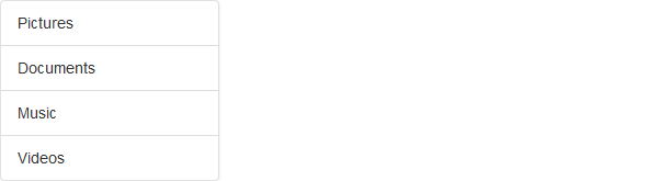
.<ul class="list-group">
<li class="list-group-item">Pictures</li>
<li class="list-group-item">Documents</li>
<li class="list-group-item">Music</li>
<li class="list-group-item">Videos</li>
</ul>
— The output of the above example will look something like this:
List Group with Linked Items
You can also hyperlink list group items with the little change in HTML markup.
Just replace the
<li> with <a> tag and use <div> element as a parent instead of <ul>. You can also add icons and badges to this list group to make it more elegant. The badges component will automatically be positioned on the right.Example
.<div class="list-group">
<a href="#" class="list-group-item active">
<span class="glyphicon glyphicon-camera"></span> Pictures <span class="badge">25</span>
</a><a href="#" class="list-group-item">
<span class="glyphicon glyphicon-file"></span> Documents <span class="badge">145</span>
</a><a href="#" class="list-group-item">
<span class="glyphicon glyphicon-music"></span> Music <span class="badge">50</span>
</a><a href="#" class="list-group-item">
<span class="glyphicon glyphicon-film"></span> Videos <span class="badge">8</span>
</a></div>
— The output of the above example will look something like this:
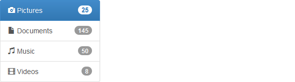
Tip:You can use the Bootstrap list group component for creating the sidebar navigation menu, e.g. displaying the list of products or categories on your website.
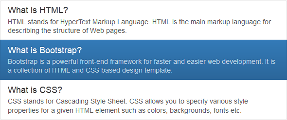
You can also add other HTML elements like headings and paragraph within these list groups.
Example
.<div class="list-group">
<a href="#" class="list-group-item">
<h4 class="list-group-item-heading">What is HTML?</h4>
<p class="list-group-item-text">HTML stands for HyperText Markup Language. HTML is the main markup language for describing the structure of Web pages.</p>
</a><a href="#" class="list-group-item active">
<h4 class="list-group-item-heading">What is Bootstrap?</h4>
<p class="list-group-item-text">Bootstrap is a powerful front-end framework for faster and easier web development. It is a collection of HTML and CSS based design template.</p>
</a><a href="#" class="list-group-item">
<h4 class="list-group-item-heading">What is CSS?</h4>
<p class="list-group-item-text">CSS stands for Cascading Style Sheet. CSS allows you to specify various style properties for a given HTML element such as colors, backgrounds, fonts etc.</p>
</a></div>
— The output of the above example will look something like this:
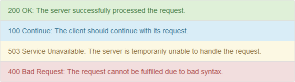
List Group with Contextual States
Like most of the other components you can also use contextual classes on the list group items to apply extra emphasis on them, like this:
Example
<ul class="list-group">
<li class="list-group-item list-group-item-success">200 OK: The server successfully processed the request.</li>
<li class="list-group-item list-group-item-info">100 Continue: The client should continue with its request.</li>
<li class="list-group-item list-group-item-warning">503 Service Unavailable: The server is temporarily unable to handle the request.</li>
<li class="list-group-item list-group-item-danger">400 Bad Request: The request cannot be fulfilled due to bad syntax.</li>
</ul>
— The output of the above example will look something like this:
Similarly, you can use these contextual classes to the linked list group items. You can also use the class
.active to specify the active list group item.Example
<div class="list-group">
<a href="#" class="list-group-item list-group-item-success">200 OK: The server successfully processed the request.</a>
<a href="#" class="list-group-item list-group-item-info active">100 Continue: The client should continue with its request.</a>
<a href="#" class="list-group-item list-group-item-warning">503 Service Unavailable: The server is temporarily unable to handle the request.</a>
<a href="#" class="list-group-item list-group-item-danger">400 Bad Request: The request cannot be fulfilled due to bad syntax.</a>
</div>
No comments:
Post a Comment