WPF ListBox Control
Introduction
The ListBox control displays a list of items. The user can select one
or multiple items depending on the selection mode. The typical usage of
a listbox in WPF is to bind its items to a list of business objects and
display them by applying a data template.
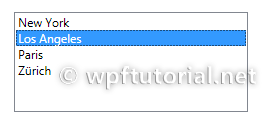
<ListBox Margin="20">
    <ListBoxItem>New York</ListBoxItem>
    <ListBoxItem>Los Angeles</ListBoxItem>
    <ListBoxItem>Paris</ListBoxItem>
    <ListBoxItem>Zürich</ListBoxItem>
</ListBox>
How to define a Trigger for IsSelected in the DataTemplate
If you want to change the appearance of a ListBoxItem when it is
selected, you have to bind the IsSelected property of the ListBoxItem.
But this is a bit tricky, you have to use a relative source with
FindAcestor to navigate up the visual tree until you reach the
ListBoxItem.
<DataTemplate x:Key="myDataTemplate">
    <Border x:Name="border" Height="50">
        <TextBlock Text="{Binding Text}" />
    </Border>
    <DataTemplate.Triggers>
        <DataTrigger Binding="{Binding RelativeSource=
            {RelativeSource Mode=FindAncestor, AncestorType=
                {x:Type ListBoxItem}},Path=IsSelected}" Value="True">
            <Setter TargetName="border" Property="Height" Value="100"/>
        </DataTrigger>
    </DataTemplate.Triggers>
</DataTemplate>


No comments:
Post a Comment