

WPF Expander Control
Introduction
 The
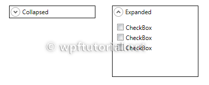
The Expander control is like a GroupBox but with the additional feature to collapse and expand its content. It derives from HeaderedContentControl so it has a Header property to set the header content, and a Content property for the expandable content.It has a
IsExpanded property to get and set if the expander is in expanded or collapsed state.In collapsed state the expander takes only the space needed by the header. In expanded state it takes the size of header and content together.
<Expander Header="More Options">
    <StackPanel Margin="10,4,0,0">
        <CheckBox Margin="4" Content="Option 1" />
        <CheckBox Margin="4" Content="Option 2" />
        <CheckBox Margin="4" Content="Option 3" />
    </StackPanel>
</Expander>
No comments:
Post a Comment