Microsoft Dot Net Master

Microsoft Dot Net Master

Thursday, June 28, 2012

WPF ListBox Control

WPF ListBox Control

Introduction

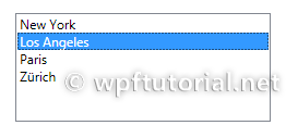
The ListBox control displays a list of items. The user can select one or multiple items depending on the selection mode. The typical usage of a listbox in WPF is to bind its items to a list of business objects and display them by applying a data template.

 
<ListBox Margin="20">
    <ListBoxItem>New York</ListBoxItem>
    <ListBoxItem>Los Angeles</ListBoxItem>
    <ListBoxItem>Paris</ListBoxItem>
    <ListBoxItem>Zürich</ListBoxItem>
</ListBox>


How to define a Trigger for IsSelected in the DataTemplate

If you want to change the appearance of a ListBoxItem when it is selected, you have to bind the IsSelected property of the ListBoxItem. But this is a bit tricky, you have to use a relative source with FindAcestor to navigate up the visual tree until you reach the ListBoxItem.
 
<DataTemplate x:Key="myDataTemplate">
    <Border x:Name="border" Height="50">
        <TextBlock Text="{Binding Text}" />
    </Border>
    <DataTemplate.Triggers>
        <DataTrigger Binding="{Binding RelativeSource=
            {RelativeSource Mode=FindAncestor, AncestorType=
                {x:Type ListBoxItem}},Path=IsSelected}" Value="True">
            <Setter TargetName="border" Property="Height" Value="100"/>
        </DataTrigger>
    </DataTemplate.Triggers>
</DataTemplate>

Popup Control

Introduction follows...

How to make the popup close, when it loses focus

Just set the StaysOpen property to False. Unfortunately this is not the default behavior
 
<Popup StaysOpen="False" />

Radio Button

Radio Button

Introduction

The RadioButton control has its name from old analog radios which had a number of programmable station buttons. When you pushed one in, the previosly selected poped out. So only one station can be selected at a time.
The RadioButton control has the same behavior. It lets the user choose one option out of a few. It the list of options gets longer, you should prefer a combo or list box instead.
To define which RadioButtons belong togehter, you have to set the GroupName to the same name.
To preselect one option set the IsChecked property to True.

 
<StackPanel>
    <RadioButton GroupName="Os" Content="Windows XP" IsChecked="True"/>
    <RadioButton GroupName="Os" Content="Windows Vista" />
    <RadioButton GroupName="Os" Content="Windows 7" />
    <RadioButton GroupName="Office" Content="Microsoft Office 2007" IsChecked="True"/>
    <RadioButton GroupName="Office" Content="Microsoft Office 2003"/>
    <RadioButton GroupName="Office" Content="Open Office"/>
</StackPanel>


How to DataBind Radio Buttons in WPF

The radio button control has a known issue with data binding. If you bind the IsChecked property to a boolean and check the RadioButton, the value gets True. But when you check another RadioButton, the databound value still remains true.
The reason for this is, that the Binding gets lost during the unchecking, because the controls internally calls ClearValue() on the dependency property.
 
<Window.Resources>
   <EnumMatchToBooleanConverter x:Key="enumConverter" />
</Window.Resources>
 
 
<RadioButton Content="Option 1" GroupName="Options1" 
             IsChecked="{Binding Path=CurrentOption, Mode=TwoWay, 
                                 Converter={StaticResource enumConverter},
                                 ConverterParameter=Option1}"  />
<RadioButton Content="Option 2" GroupName="Options2" 
             IsChecked="{Binding Path=CurrentOption, Mode=TwoWay, 
                                 Converter={StaticResource enumConverter},
                                 ConverterParameter=Option2}"  />
<RadioButton Content="Option 3" GroupName="Options3" 
             IsChecked="{Binding Path=CurrentOption, Mode=TwoWay, 
                                 Converter={StaticResource enumConverter},
                                 ConverterParameter=Option3}"  />


public class EnumMatchToBooleanConverter : IValueConverter
    {
        public object Convert(object value, Type targetType, 
                              object parameter, CultureInfo culture)
        {
            if (value == null || parameter == null)
                return false;
 
            string checkValue = value.ToString();
            string targetValue = parameter.ToString();
            return checkValue.Equals(targetValue, 
                     StringComparison.InvariantCultureIgnoreCase);
        }
 
        public object ConvertBack(object value, Type targetType, 
                                  object parameter, CultureInfo culture)
        {
            if (value == null || parameter == null)
                return null;
 
            bool useValue = (bool)value;
            string targetValue = parameter.ToString();
            if (useValue)
                return Enum.Parse(targetType, targetValue);
 
            return null;
        }
    }   

WPF Slider Control

How to Make a Slider Snap to Integer Values

If you just set the Minimum and Maximum of a slider and choose a value the result is determined by the pixel position of the thumb. The value is typically a high-precision value with many decimal places. To allow only integer values you have to set the IsSnapToTickEnabled property to True.
<Slider Minimum="0"
        Maximum="20"
        IsSnapToTickEnabled="True"
        TickFrequency="2"

Dialogs in WPF

OK and Cancel Buttons in a Dialog

You have a modal dialog with several buttons on it and you want to automatically close it, when the user presses on some of them. To do this you have to set IsCancel="true" on all buttons that should close the dialog and return false. On one button you set IsDefault="true" this will be executed when you press [Enter]. It closes the dialog and returns... also false. To return true here you have to register a callback that sets the DialogResult to true
 
<Window xmlns="http://schemas.microsoft.com/winfx/2006/xaml/presentation"
         xmlns:x="http://schemas.microsoft.com/winfx/2006/xaml">
    <StackPanel>
        <Button Content="Cancel" IsCancel="True" />
        <Button Click="OkClick" Content="Ok" IsDefault="true" />
    </StackPanel>
</Window>


private void OkClick(object sender, RoutedEventArgs e)  
{
    this.DialogResult = true;  
}
 

WPF PasswordBox Control

The password box control is a special type of TextBox designed to enter passwords. The typed in characters are replaced by asterisks. Since the password box contains a sensible password it does not allow cut, copy, undo and redo commands.
 
<StackPanel>
      <Label Content="Password:" />
      <PasswordBox x:Name="passwordBox" Width="130" />
</StackPanel>


Change the password character

To replace the asteriks character by another character, set the PasswordChar property to the character you desire.
 
<PasswordBox x:Name="passwordBox" PasswordChar="*" />


Limit the length of the password

To limit the length of the password a user can enter set the MaxLength property to the amount of characters you allow.
 
<PasswordBox x:Name="passwordBox" MaxLength="8" />


Databind the Password Property of a WPF PasswordBox

When you try to databind the password property of a PasswordBox you will recognize that you cannot do data binding on it. The reason for this is, that the password property is not backed by a DependencyProperty.
The reason is databinding passwords is not a good design for security reasons and should be avoided. But sometimes this security is not necessary, then it's only cumbersome that you cannot bind to the password property. In this special cases you can take advantage of the following PasswortBoxHelper.
 
<StackPanel>
    <PasswordBox w:PasswordHelper.Attach="True" 
         w:PasswordHelper.Password="{Binding Text, ElementName=plain, Mode=TwoWay}" 
                 Width="130"/>
    <TextBlock Padding="10,0" x:Name="plain" />
</StackPanel>
 
 
The PasswordHelper is attached to the password box by calling the PasswordHelper.Attach property. The attached property PasswordHelper.Password provides a bindable copy of the original password property of the PasswordBox control.
 
public static class PasswordHelper
{
    public static readonly DependencyProperty PasswordProperty =
        DependencyProperty.RegisterAttached("Password",
        typeof(string), typeof(PasswordHelper),
        new FrameworkPropertyMetadata(string.Empty, OnPasswordPropertyChanged));
 
    public static readonly DependencyProperty AttachProperty =
        DependencyProperty.RegisterAttached("Attach",
        typeof(bool), typeof(PasswordHelper), new PropertyMetadata(false, Attach));
 
    private static readonly DependencyProperty IsUpdatingProperty =
       DependencyProperty.RegisterAttached("IsUpdating", typeof(bool), 
       typeof(PasswordHelper));
 
 
    public static void SetAttach(DependencyObject dp, bool value)
    {
        dp.SetValue(AttachProperty, value);
    }
 
    public static bool GetAttach(DependencyObject dp)
    {
        return (bool)dp.GetValue(AttachProperty);
    }
 
    public static string GetPassword(DependencyObject dp)
    {
        return (string)dp.GetValue(PasswordProperty);
    }
 
    public static void SetPassword(DependencyObject dp, string value)
    {
        dp.SetValue(PasswordProperty, value);
    }
 
    private static bool GetIsUpdating(DependencyObject dp)
    {
        return (bool)dp.GetValue(IsUpdatingProperty);
    }
 
    private static void SetIsUpdating(DependencyObject dp, bool value)
    {
        dp.SetValue(IsUpdatingProperty, value);
    }
 
    private static void OnPasswordPropertyChanged(DependencyObject sender,
        DependencyPropertyChangedEventArgs e)
    {
        PasswordBox passwordBox = sender as PasswordBox;
        passwordBox.PasswordChanged -= PasswordChanged;
 
        if (!(bool)GetIsUpdating(passwordBox))
        {
            passwordBox.Password = (string)e.NewValue;
        }
        passwordBox.PasswordChanged += PasswordChanged;
    }
 
    private static void Attach(DependencyObject sender,
        DependencyPropertyChangedEventArgs e)
    {
        PasswordBox passwordBox = sender as PasswordBox;
 
        if (passwordBox == null)
            return;
 
        if ((bool)e.OldValue)
        {
            passwordBox.PasswordChanged -= PasswordChanged;
        }
 
        if ((bool)e.NewValue)
        {
            passwordBox.PasswordChanged += PasswordChanged;
        }
    }
 
    private static void PasswordChanged(object sender, RoutedEventArgs e)
    {
        PasswordBox passwordBox = sender as PasswordBox;
        SetIsUpdating(passwordBox, true);
        SetPassword(passwordBox, passwordBox.Password);
        SetIsUpdating(passwordBox, false);
    }
}

Menus in WPF

Menu

The Menu control derives from HeaderedItemsControl. It stacks it items horizontally and draws the typical gray background. The only property that the Menu adds to ItemsControl is the IsMainMenu property. This controls if the menu grabs the focus if the user presses F10 or the ALT key.
 
<Menu IsMainMenu="True">
    <MenuItem Header="_File" />
    <MenuItem Header="_Edit" />
    <MenuItem Header="_View" />
    <MenuItem Header="_Window" />
    <MenuItem Header="_Help" />
</Menu>


MenuItem

The MenuItem is a HeaderedItemsControl. The content of the Header property is the caption of the menu. The Items of a MenuItems are its sub menus. The Icon property renders a second content on the left of the caption. This is typically used to draw a little image. But it can be used for type of content.
You can define a keyboard shortcut by adding an underscore in front of a character.
 
<MenuItem Header="_Edit">
    <MenuItem Header="_Cut" Command="Cut">
        <MenuItem.Icon>
            <Image Source="Images/cut.png" />
        </MenuItem.Icon>
    </MenuItem>
    <MenuItem Header="_Copy" Command="Copy">
        <MenuItem.Icon>
            <Image Source="Images/copy.png" />
        </MenuItem.Icon>
    </MenuItem>
    <MenuItem Header="_Paste" Command="Paste">
        <MenuItem.Icon>
            <Image Source="Images/paste.png" />
        </MenuItem.Icon>
    </MenuItem>
</MenuItem>


Checkable MenuItems

You can make a menu item checkable by setting the IsCheckable property to true. The check state can be queried by the IsChecked property. To get notified when the check state changes you can add a handler to the Checked and Unchecked property.
 
<MenuItem Header="_Debug">
    <MenuItem Header="Enable Debugging" IsCheckable="True" />
</MenuItem>


Separators

Separator is a simple control to group menu items. It's rendered as a horizontal line. It can also be used in ToolBar and StatusBar.
 
<Menu>
    <MenuItem Header="_File">
        <MenuItem Header="_New..." />
        <Separator />
        <MenuItem Header="_Open..." />
        <Separator />
        <MenuItem Header="_Save" />
        <MenuItem Header="_Save As..." />
        <Separator />
        <MenuItem Header="_Exit" />
    </MenuItem>
</Menu>


Callbacks

You can register a callback to any menu item by adding a callback to the Click event.
 
<Menu>
    <MenuItem Header="_File">
        <MenuItem Header="_New..."  Click="New_Click"/>
    </MenuItem>
</Menu>


private void New_Click(object sender, RoutedEventArgs e)
{
    MessageBox.Show("You clicked 'New...'");
}


How to bind MenuItems dynamically using MVVM

If you are using the model-view-viewmodel pattern, you probably want to define the available menu command dynamically in your code and then bind them to a MenuItem control. The following sample shows you how to do this:
 
<Menu>
    <Menu.Resources>
        <Style x:Key="ThemeMenuItemStyle" TargetType="MenuItem">
           <Setter Property="Header" Value="{Binding Name}"></Setter>
           <Setter Property="Command" Value="{Binding ActivateCommand}"/>
           <Setter Property="IsChecked" Value="{Binding IsActive}" />
           <Setter Property="IsCheckable" Value="True"/>
        </Style>
    </Menu.Resources>
    <MenuItem Header="Themes" ItemsSource="{Binding Themes}" 
              ItemContainerStyle="{StaticResource ThemeMenuItemStyle}"  />
</Menu>


Keyboard Shortcuts

To add a keyboard shortcut to a menu item, add a underscode "_" in front of the caracter you want to use as your hot key. This automatically sets the InputGestureText to an appropriate value. But you can also override the proposed text by setting this property to a text of your choice.

Context Menus in WPF

Context Menus can be defined on any WPF controls by setting the ContextMenu property to an instance of a ContextMenu. The items of a context menu are normal MenuItems.
 
<RichTextBox>
    <RichTextBox.ContextMenu>
        <ContextMenu>
            <MenuItem Command="Cut">
                <MenuItem.Icon>
                    <Image Source="Images/cut.png" />
                </MenuItem.Icon>
            </MenuItem>
            <MenuItem Command="Copy">
                <MenuItem.Icon>
                    <Image Source="Images/copy.png" />
                </MenuItem.Icon>
            </MenuItem>
            <MenuItem Command="Paste">
                <MenuItem.Icon>
                    <Image Source="Images/paste.png" />
                </MenuItem.Icon>
            </MenuItem>
        </ContextMenu>
    </RichTextBox.ContextMenu>
</RichTextBox>


Show ContextMenus on a disabled controls

If you rightclick on a disabled control, no context menu is shown by default. To enable the context menu for disabled controls you can set the ShowOnDisabled attached property of the ContextMenuService to True.
 
<RichTextBox IsEnabled="False" ContextMenuService.ShowOnDisabled="True">
    <RichTextBox.ContextMenu>
        <ContextMenu>
            ...
        </ContextMenu>
    </RichTextBox.ContextMenu>
</RichTextBox>


Merge ContextMenus

If you want to fill a menu with items coming from multiple sources, you can use the CompositeCollection to merge multiple collection into one.
 
<Window xmlns="http://schemas.microsoft.com/winfx/2006/xaml/presentation"
        xmlns:x="http://schemas.microsoft.com/winfx/2006/xaml"
        xmlns:sys="clr-namespace:System;assembly=mscorlib">
  <Grid Background="Transparent">
    <Grid.Resources>
        <x:Array Type="{x:Type sys:Object}" x:Key="extensions">
            <Separator />
            <MenuItem Header="Extension MenuItem 1" />
            <MenuItem Header="Extension MenuItem 2" />
            <MenuItem Header="Extension MenuItem 3" />
        </x:Array>
    </Grid.Resources>
    <Grid.ContextMenu>
        <ContextMenu>
            <ContextMenu.ItemsSource>
                <CompositeCollection>
                    <MenuItem Header="Standard MenuItem 1" />
                    <MenuItem Header="Standard MenuItem 2" />
                    <MenuItem Header="Standard MenuItem 3" />
                    <CollectionContainer Collection="{StaticResource extensions}" />
                </CompositeCollection>
            </ContextMenu.ItemsSource>
        </ContextMenu>
    </Grid.ContextMenu>
  </Grid>
</Window>


How to bind a Command on a ContextMenu within a DataTemplate using MVVM

Since the Popuup control has it's separate visual tree, you cannot use find ancestor to find the Grid. The trick here is to use the PlacementTarget property, that contains the element, the ContextMenu is aligned to, what is the Grid in our case.
But this is only half of the solution. Because of the data template, the DataContext is set to a dataitem, and not the view model. So you need another relative source lookup, to find the view model. Trick Nr. 2 is to use the Tag property to bind the view model from outside to the grid, which is the PlacementTarget used above. And there we are.
 
<DataTemplate>
   <Grid Tag="{Binding DataContext, RelativeSource={RelativeSource AncestorType={x:Type ListBox}}}">
      <Grid.ContextMenu>
          <ContextMenu DataContext="{Binding Path=PlacementTarget.Tag, RelativeSource={RelativeSource Self}}">
             <MenuItem Content="Cut" Command="{Binding CutCommand}" />
             <MenuItem Content="Copy" Command="{Binding CopyCommand}" />
             <MenuItem Content="Paste" Command="{Binding PasteCommand}" />
          </ContextMenu>
      </Grid.ContextMenu>
   </Grid>
</DataTemplate>


How to open a context menu from code

The following sample shows you how to open a context menu of a control programmatically:
 
private void OpenContextMenu(FrameworkElement element)
{
    if( element.ContextMenu != null )
    {
       element.ContextMenu.PlacementTarget = element;
       element.ContextMenu.IsOpen = true;
    }
}

WPF DataGrid Control

Introduction

Since .NET 4.0, Microsoft is shipping a DataGrid control that provides all the basic functionality needed, like:

Basic usage: Auto generate columns

To show a basic data grid , just drop a DataGrid control to your view and bind the ItemsSource to a collection of data objects and you're done. The DataGrid provides a feature called AutoGenerateColumns that automatically generates column according to the public properties of your data objects. It generates the following types of columns:
  • TextBox columns for string values
  • CheckBox columns for boolean values
  • ComboBox columns for enumerable values
  • Hyperlink columns for Uri values
 
<DataGrid ItemsSource="{Binding Customers}" />


Manually define columns

Alternatively you can define your columns manually by setting the AutoGenerateColumns property to False. In this case you have to define the columns in the Columns collection of the data grid. You have the following types of columns available:
  • DataGridCheckBoxColumn for boolean values
  • DataGridComboBoxColumn for enumerable values
  • DataGridHyperlinkColumn for Uri values
  • DataGridTemplateColumn to show any types of data by defining your own cell template
  • DataGridTextColumn to show text values
 
<DataGrid ItemsSource="{Binding Customers}" AutoGenerateColumns="False" >
    <DataGrid.Columns>
        <DataGridTemplateColumn Header="Image" Width="SizeToCells" IsReadOnly="True">
            <DataGridTemplateColumn.CellTemplate>
                <DataTemplate>
                    <Image Source="{Binding Image}" />
                </DataTemplate>
            </DataGridTemplateColumn.CellTemplate>
            </DataGridTemplateColumn>
    </DataGrid.Columns>
</DataGrid>


Selection

The data grid includes a variety of selection modes. They are configured by the SelectionMode and SelectionUnit property.
  • The SelectionMode can be set to Single or Extended to define if one or multiple units can be selected simultaneously.
  • The SelectionUnit defines the scope of one selection unit. It can be set to Cell, CellAndRowHeader and FullRow.
 
<DataGrid ItemsSource="{Binding Customers}" 
          SelectionMode="Extended" SelectionUnit="Cell" />


Column sorting, reordering and resizing

The data grid provides features to sort, reorder and resize columns. They can be enabled or disabled by the following properties:
  • CanUserReorderColumns enables or disables column re-ordering
  • CanUserResizeColumns enables or disables column resizing
  • CanUserResizeRows enables or disables row resizing
  • CanUserSortColumns enables or disables column sorting
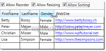
 
<DataGrid ItemsSource="{Binding Customers}" 
          CanUserReorderColumns="True" CanUserResizeColumns="True" 
          CanUserResizeRows="False" CanUserSortColumns="True"/>


Grouping

The data grid also supports grouping. To enable grouping you have to define a CollectionView that contains to least one GroupDescription that defines the criterias how to group.
 
Customers = new ListCollectionView(_customers);
Customers.GroupDescriptions.Add(new PropertyGroupDescription("Gender"));
 
 
Second thing you need to do is defining a template how the groups should look like. You can do this by setting the GroupStyle to something like the following snippet.
 
<DataGrid ItemsSource="{Binding GroupedCustomers}">
    <DataGrid.GroupStyle>
        <GroupStyle>
            <GroupStyle.HeaderTemplate>
                <DataTemplate>
                    <StackPanel>
                        <TextBlock Text="{Binding Path=Name}" />
                    </StackPanel>
                </DataTemplate>
            </GroupStyle.HeaderTemplate>
            <GroupStyle.ContainerStyle>
                <Style TargetType="{x:Type GroupItem}">
                    <Setter Property="Template">
                        <Setter.Value>
                            <ControlTemplate TargetType="{x:Type GroupItem}">
                                <Expander>
                                    <Expander.Header>
                                        <StackPanel Orientation="Horizontal">
                                          <TextBlock Text="{Binding Path=Name}" />
                                          <TextBlock Text="{Binding Path=ItemCount}"/>
                                          <TextBlock Text="Items"/>
                                        </StackPanel>
                                    </Expander.Header>
                                    <ItemsPresenter />
                                </Expander>
                            </ControlTemplate>
                        </Setter.Value>
                    </Setter>
                </Style>
            </GroupStyle.ContainerStyle>
        </GroupStyle>
    </DataGrid.GroupStyle>
</DataGrid>


Row Details

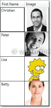
The data grid provides a feature that shows a detail panel for a selected row. It can be enabled by setting a DataTemplate to the RowDetailsTemplate property. The data template gets the object that is bound to this row passed by the DataContext and can bind to it.
 
<DataGrid ItemsSource="{Binding Customers}">
    <DataGrid.Columns>
    <DataGridTextColumn Header="First Name" Binding="{Binding FirstName}" />
    </DataGrid.Columns>
    <DataGrid.RowDetailsTemplate>
        <DataTemplate>
            <Image Height="100" Source="{Binding Image}" />
        </DataTemplate>
    </DataGrid.RowDetailsTemplate>
</DataGrid>


Row Details depending on the type of data

You can specify a RowDetailsTemplateSelector that selects a data template according to the type or data that this row contains. To do this, create a type that derives from DataTemplateSelector and override the SelectTemplate method. In the items argument you get the data and you can determine which data template to display. Return an instance of that data template as return value.
 
public class GenderTemplateSelector : DataTemplateSelector
{
    public DataTemplate MaleTemplate { get; set; }
    public DataTemplate FemaleTemplate { get; set; }
 
    public override DataTemplate SelectTemplate(object item, 
                  DependencyObject container)
    {
        var customer = item as Customer;
        if (customer == null)
            return base.SelectTemplate(item, container);
 
        if( customer.Gender == Gender.Male)
        {
            return MaleTemplate;
        }
        return FemaleTemplate;
    }
}


<l:GenderTemplateSelector x:Key="genderTemplateSelector">
    <l:GenderTemplateSelector.MaleTemplate>
        <DataTemplate>
            <Grid Background="LightBlue">
                <Image Source="{Binding Image}" Width="50" />
            </Grid>
        </DataTemplate>
    </l:GenderTemplateSelector.MaleTemplate>
    <l:GenderTemplateSelector.FemaleTemplate>
        <DataTemplate>
            <Grid Background="Salmon">
                <Image Source="{Binding Image}" Width="50" />
            </Grid>
        </DataTemplate>
    </l:GenderTemplateSelector.FemaleTemplate>
</l:GenderTemplateSelector>
 
<DataGrid ItemsSource="{Binding Customers}" 
          RowDetailsTemplateSelector="{StaticResource genderTemplateSelector}" />


Alternating BackgroundBrush

You can define a an AlternatingRowBackground that is applied every even row. You can additionally specify an AlternationCount if you only want to ink every every n-th data row.
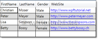
 
<DataGrid ItemsSource="{Binding Customers}" 
          AlternatingRowBackground="Gainsboro"  AlternationCount="2"/>


Frozen Columns

The data grid also supports the feature to freeze columns. That means they stay visible while you scoll horizontally through all columns. This is a useful feature to keep a referencing column like an ID or a name always visible to keep your orientation while scrolling.
To freeze a numer of columns just set the FrozenColumnCount property to the number of columns you want to freeze.
 
<DataGrid ItemsSource="{Binding Customers}" FrozenColumnCount="2"  />


Headers visbility

You can control the visibility of row and column headers by setting the HeadersVisibility property to either None,Row,Column or All
 
<DataGrid ItemsSource="{Binding Customers}" HeadersVisibility="None" />


How to template autogenerated columns

If you want to autogenerate columns using AutoGenerateColumns="True", you cannot use CellTemplates, because the DataGrid autogenerates either a text, combo, hyperlink or checkbox column, but none of these are templateable. A simple workaround is to hook into the autogeneration, cancel it and always create a DataGridTemplateColumn. The following snippet shows the idea (the code is just a draft):
 
public class MyDataGrid : DataGrid
{
 
    public DataTemplateSelector CellTemplateSelector
    {
        get { return (DataTemplateSelector)GetValue(CellTemplateSelectorProperty); }
        set { SetValue(CellTemplateSelectorProperty, value); }
    }
 
    public static readonly DependencyProperty CellTemplateSelectorProperty =
        DependencyProperty.Register("Selector", typeof(DataTemplateSelector), typeof(MyDataGrid), 
        new FrameworkPropertyMetadata(null));


    protected override void OnAutoGeneratingColumn(DataGridAutoGeneratingColumnEventArgs e)
    {
        e.Cancel = true;
        Columns.Add(new DataGridTemplateColumn
            {
                Header = e.Column.Header, 
                CellTemplateSelector = CellTemplateSelector
            });
    }
}


<l:MyDataGrid ItemsSource="{Binding}" 
              AutoGenerateColumns="True" 
              CellTemplateSelector="{StaticResource templateSelector}" />
WPF TextBox

How to enable spell checking

TextBox and RichTextBox provide an out-of-the-box spell checking functionality. It is available for the following languages: English, Spanish, German and French. It can be enabled by setting the attached property SpellCheck.IsEnabled to true.
 
    <TextBox SpellCheck.IsEnabled="True" Language="en-US" />


How to validate input

By using a regular expression, you can easily limit and validate the input of the user. The following code snippet shows how to do it:
 
protected override void OnTextInput(TextCompositionEventArgs e)
{
    string fullText = Text.Remove(SelectionStart, SelectionLength) + e.Text;
    if (_regex != null && !_regex.IsMatch(fullText))
    {
        e.Handled = true;
    }
    else
    {
        base.OnTextInput(e);
    }
}